
How to Track and Visualize Your Climbing Ascents
A Simple ClimbingTracker for Visualizing Your Progress
When it comes to track of my training, I am not a precise person. Climbing for me is not only training, but also outdoor adventure and connection with the rock, and the mountain.
But a question naturally appears:
How do you track your climbing progress without turning your passion into a spreadsheet?
Traditional training logs work for some climbers. For others, like me, they feel demotivating and technical. If you are also like me, demotivated to count my pull-ups in the gym, but want to track your climbing ascents this guide is for you!
I created a tool whichs visualizes my climbing ascents. There is more: it is flexible to select specific features of your routes, and make effective analysis. The tool is called Notion.
In this article, you will learn how to build a simple and interactive climbing training tracker to visualize your climbing ascents, analyze your grade progression, and monitor your development over time.
Why Tracking Your Climbing Progress Matters
Tracking climbing progress is important! For me, the tracking my climbing ascents was the most important part. Indeed, when you monitor your climbing ascents, you can:
See your grade progression over time
Understand your onsight vs redpoint ratio
Analyze outdoor vs indoor performance
Prepare yourself more consciously for your next project
Without tracking, it’s easy to rely on memory. But memory is not strong enough sometimes. A clear climbing ascent visualization allows you to understand whether you are truly improving or simply accumulating volume.
Why Traditional Training Logs Don’t Work for Everyone
Some climbers, me included, may struggle with detailed training logs. For me, tracking training in the traditional way meant
Analyzing training data, which felt abstract and not related to my real climbing progress
The connection between indoor and outdoor ascents was difficult to study
Writing down every long workout, which was time-consuming
For those climbers, what truly matters is:
“How many 6c onsight outdoor routes did I climb this season?”
That is where a climbing ascents tracker becomes more meaningful than a traditional training log..
Why Customized Climbing Tracker in Notion Works
Several apps track climbing routes. However, most are limited in flexibility. They allow you to log climbs but not to fully customize your analysis. The solution is to implement your tracker yourself, with a tool is easy to use. Here comes Notion. It offers:
Fully customizable database
Flexible filtering and visualization
No coding required
Free basic version available
With Notion, you can build your own climbing log system tailored to your needs.
Step-by-Step: Build Your Climbing Ascents Tracker in Notion
I want to describe here how to implement your climbing ascents visualization. It doesn’t require a lot of time, but it requires a bit of patience to understand how Notion works and to adapt it to your needs.
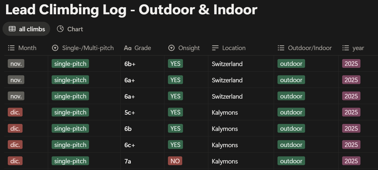
Step 1: Create Your Climbing Table
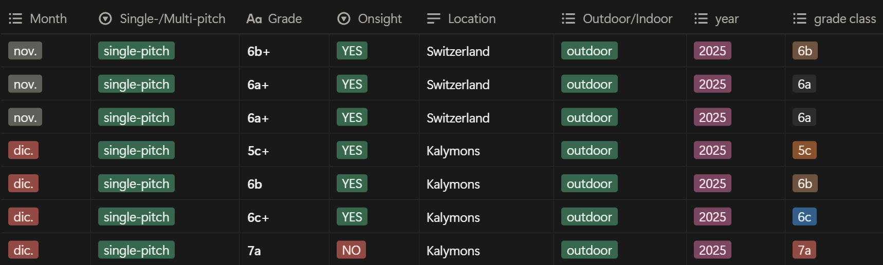
To visualize climbing data, you first need a database. Create a table where:
Each row represents one climb
Each column represents a feature of that climb
Suggested columns:
Month
Single/Multipitch
Grade
Onsight
Location
Outdoor/Indoor
Year
The main principle is quite simple: if you want to visualize something, you must first create a column for it.
For example:
Want to analyze the year 2025 season? → Add a Year column.
Want to filter onsight ascents? → Add an Onsight column.
This table becomes your climbing progress database.
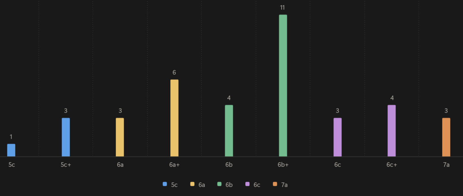
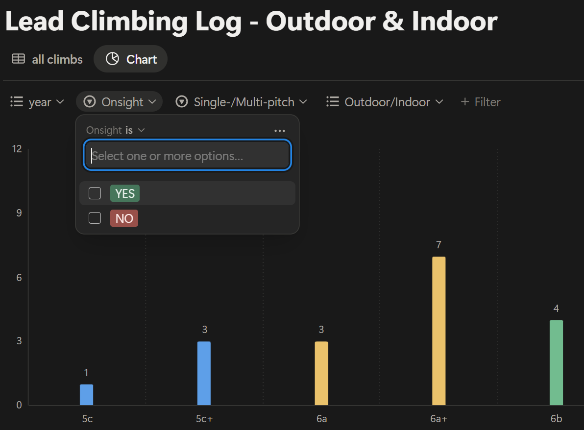
Step 2: Create Your Climbing Histogram
Once the table is ready, you can build your visualization. In Notion:
Add a chart to your table view
Select “Histogram”
Set the X-axis to “Grade”
Set the Y-axis to “Count”
The chart will automatically count how many routes you climbed for each grade. This creates an immediate visual representation of your climbing ascents.
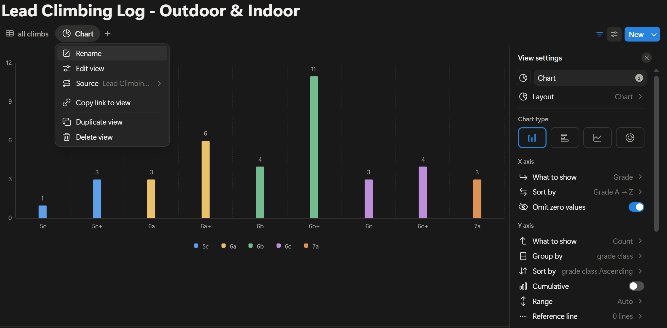
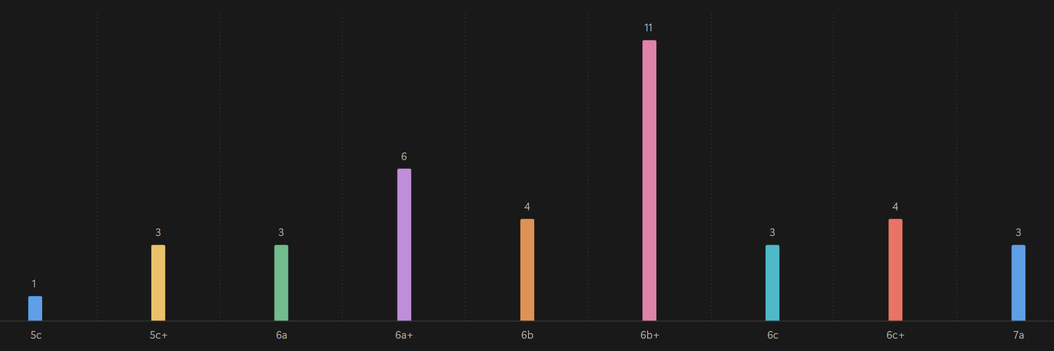
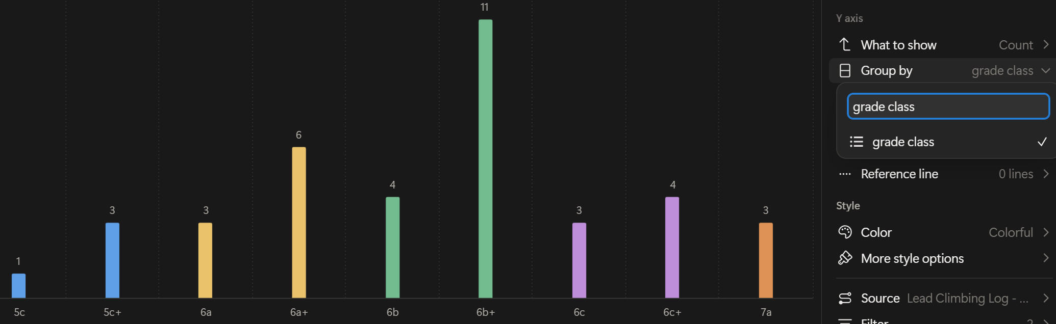
Step 3: Colors Grouping for Grades
If you want to log your ascents for many grades, like from 5c to 7a, your histogram may become visually chaotic: if you have 9 columns (one for every grade), you will have 9 different colors. To improve clarity, you can group the climbing grades: each group has a color in the histogram, which is different from another group.
How to do:
Add a new column in the climbing table describing the group.
Examples of groups. Group 1 includes grades 5c & 5c+, group 2 the grades 6a & 6a+, group 3 the grades 6b & 6b+, group 4 the grades 6c & 6c+, group 5 the grade 7a.For each climb in the table, assign the grade class.
Example. A 5c belongs to group 1, 5c+ belongs to the same group 1.In the chart settings, use the “Group by” function and select “Grade Class”
Now your chart becomes cleaner and easier to interpret.
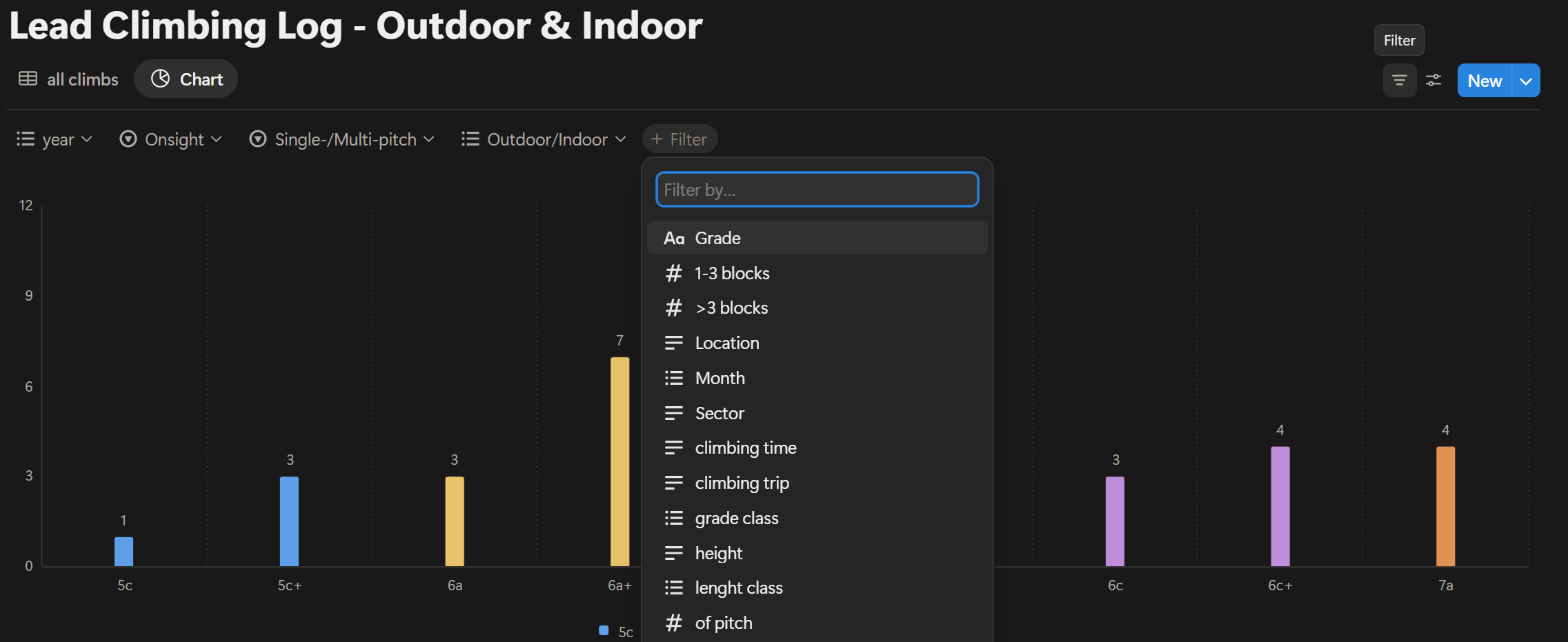
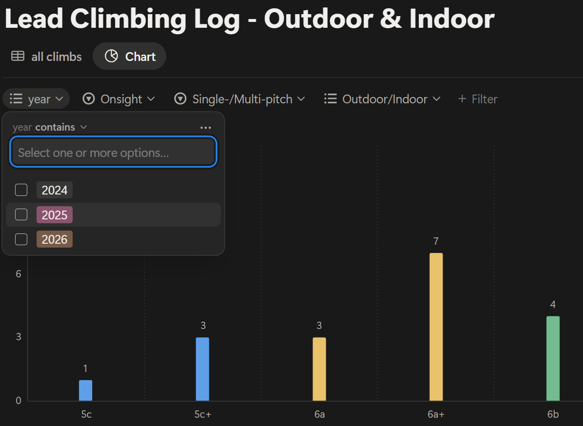
Step 4: Create the Filters
Filters are where this system becomes powerful. You can create filters such as:
Year = 2025
Onsight = Yes
Indoor = No
Single/Multipitch = Singlepitch
With filters, you can answer specific questions:
How many 6b onsight routes did I climb this summer?
How does my indoor climbing compare to outdoor performance?
Is my redpoint level increasing year after year?
This flexibility is what makes Notion a strong climbing performance tracking tool.
Advanced Climbing Progress Analysis
Once your system is in place, you can analyze deeper trends:
Seasonal progression
Ratio between onsight and redpoint
Outdoor progression compared to gym training
Preparation for harder multipitch routes
This tool allows you to have a realistic understanding of your performance in climbing ascents. This gives a realistic feeling of climbing skills, and reviewing your grade distribution and onsight consistency can reveal whether you are truly ready for your next project.
Limits of Using Notion for Climbing Ascents Tracking
Some explained limits are:
It requires some initial setup and organization.
As you may have noticed, this method is a bit technical and requires some focus and detailed organization. But once it is ready, it works smoothly and efficiently.
The free version allows only one chart.
This limits a bit. Indeed, if you would also track your multipitch ascents, you should have another chart, since the features for a multipitch are different from a single pitch.The climbing table may become very long over the season.
A solution would be to subscribe to some advanced plan in Notion, where you can build multiple climbing tables and multiple charts so that you divide your analysis into groups.
For long-term tracking or high number of climbing ascents, upgrading to a paid plan may offer more flexibility.
However, I believe this is a great approach for a first analysis of your climbing ascents.
Conclusions
I am honestly very satisfied, because it’s what I was looking for: a nice visualization of my climbing ascents, and the flexibility to define and select the climbing features more suited to analyzing my climbing progress.
In terms of training effect, visualizing your climbing ascents helps you in:
Understand your climbing progression
Identify the evolution of your onsight grade
Highlight the difference between indoor and outdoor climbing performance
Prepare more intentionally for harder climbs
My next step: to do the same for multipitch, since I have some hard projects in mind for next summer ;)